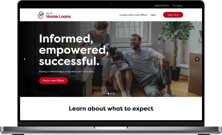
Case Study
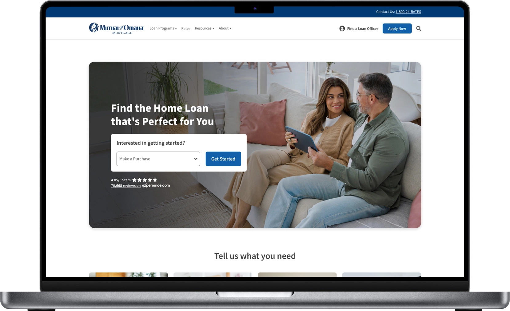
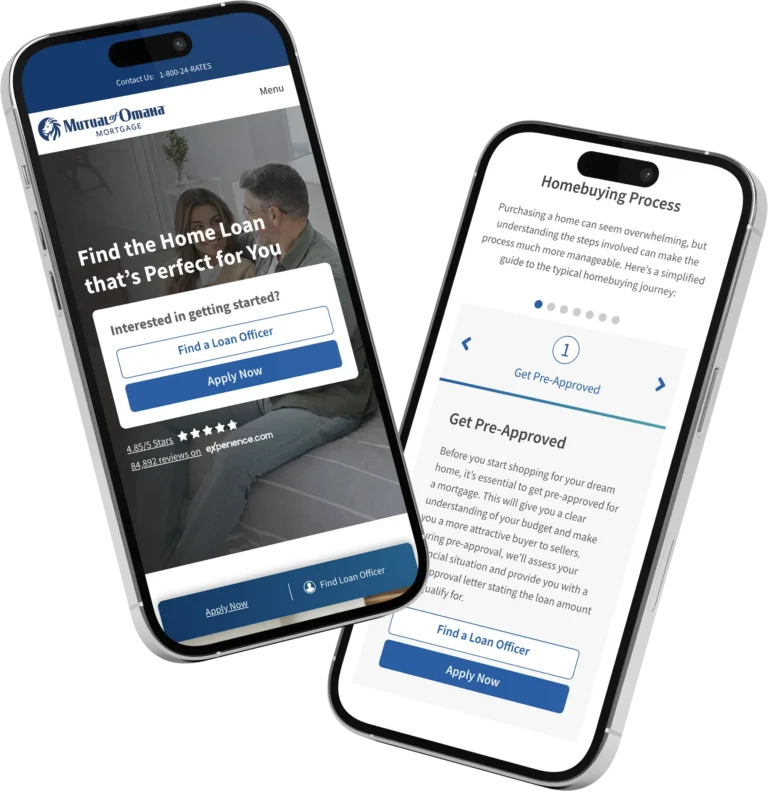
Mutual of Omaha Mortgage, a leading national mortgage lender, wanted to refresh its online presence to better connect with users. The old website, slowed by an outdated design, needed a full redo. The goal was to create a fast, clean site with a clear message, while improving how it works and feels for visitors.
Research
- Competitor Review: Checked out other mortgage sites to spot modern trends, focusing on easy use and strong branding.
- User Insights: Looked at how users navigated the old site to find what could be better.
Brand Development
- Even Spacing: Added consistent spacing to make it easier to read and look at.
- Sharp Text: Picked clean, modern fonts to feel pro yet friendly.
- Smooth Navigation: Fixed the layout so finding things like loan applications or FAQs is quick and simple.
Design
- Mapped out how visitors move around, from learning about loans to applying.
- Simplified the structure for natural, easy browsing.
- Used bright, quality photos of homes and families to tap into the dream of owning a home.
Accessibility
- Boosted contrast to make text pop and easier to see.
- Made sure buttons and links stand out when hovered over or clicked, helping everyone use it.
- Ensured that the website is semantically accurate with headings and text.
Development
- Worked closely with the marketing team and an external back-end developer to bring the design to life, keeping the site fast and smooth.
Testing
- Tested with our internal team and current customers.
Ongoing Updates
- Keep tweaking the site to stay fresh, fix feedback, and match marketing goals.
- Listen to what customers say directly.
Conclusion
The updated Mutual of Omaha Mortgage website is now fast, clean, and right to the point. With even spacing, sharp text, and smooth navigation—plus a big focus on speed and user comfort—this project made the site more enjoyable and effective. It shows how a smart redesign can lift a brand and bring real results in the busy mortgage world.
