- Development, Web Design
Keller Home Loans Website

About the Project
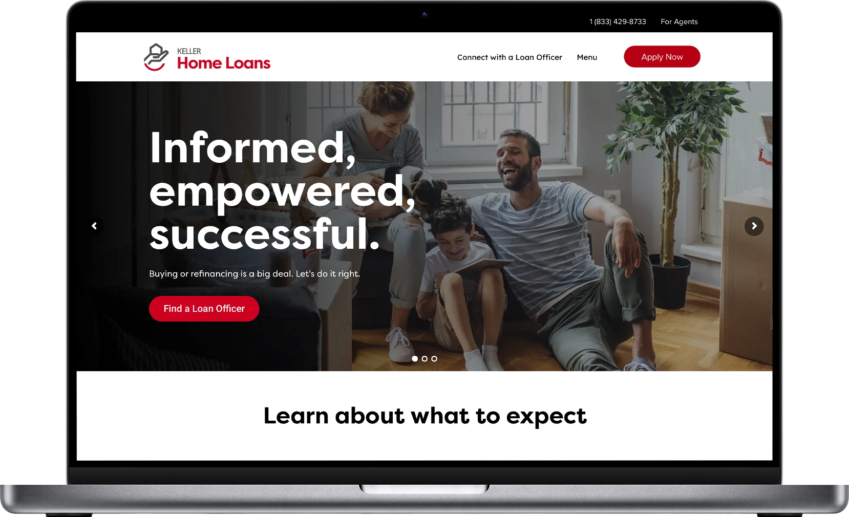
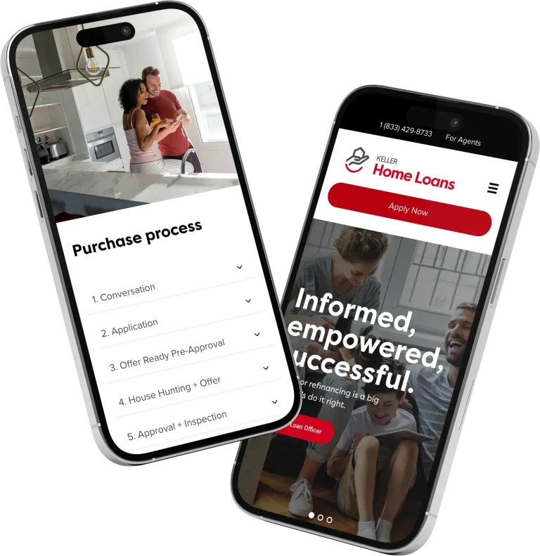
I played a key role in redesigning Keller Home Loans’ website, a leading national mortgage lender. Following its acquisition and rebranding, the site transitioned from an outdated green and grey to a striking black and red color scheme. The new design features modern elements like generous spacing, rounded corners, and bold colors. These enhancements revitalized the visual identity, improved user experience, and boosted overall functionality.
Deliverables
- Wireframes (Desktop, Mobile)
- XD Prototype (Desktop, Mobile)
- WordPress Site

Case Study
Research:
- Competitive Analysis: Studied competitors to see modern trends in mortgage lending websites, focusing on usability and branding.
- Analytics Review: Examined user behavior on the old site for areas of improvement.
Brand development:
- Generous Spacing: To enhance readability and focus.
- Rounded Corners: For a softer, more approachable look.
- Bold Colors: To draw attention to key actions like ‘Apply for Loan’.
Design:
- User Journey: Outlined the typical paths users might take on the site, from learning about mortgages to applying for a loan.
- Information Architecture: Simplified the site structure for intuitive navigation.
- Implemented high-quality images of homes and families to evoke the dream of homeownership.
- Used the red color strategically to guide users through important actions or information.
Accessibility:
- Adjusted contrast ratios for better readability.
- Ensured all interactive elements had sufficient hover and focus states for accessibility.
Development:
- Worked closely with a contract developer to ensure the design principles were translated correctly.
Testing:
- Conducted with a focus group including potential homebuyers and existing customers.
- Feedback included positive reactions to the new color scheme but requests for clearer explanations of mortgage products.
Ongoing improvements:
- Regular updates to keep the site fresh, address user feedback, and align with new marketing strategies.
- Continue to gather feedback through direct customer interactions.f
Conclusion:
The redesign of Keller Home Loans’ website not only revitalized its visual identity but also significantly improved user interaction and engagement. The strategic use of color, modern design elements, and a focus on user experience led to better brand alignment, increased user satisfaction, and higher conversion rates. This project exemplifies how a thoughtful redesign can positively impact both branding and business metrics in the competitive mortgage lending industry.
Related Projects
UI/UX DESIGN
MORE Home Valuation App
WEB DESIGN


