Case Study
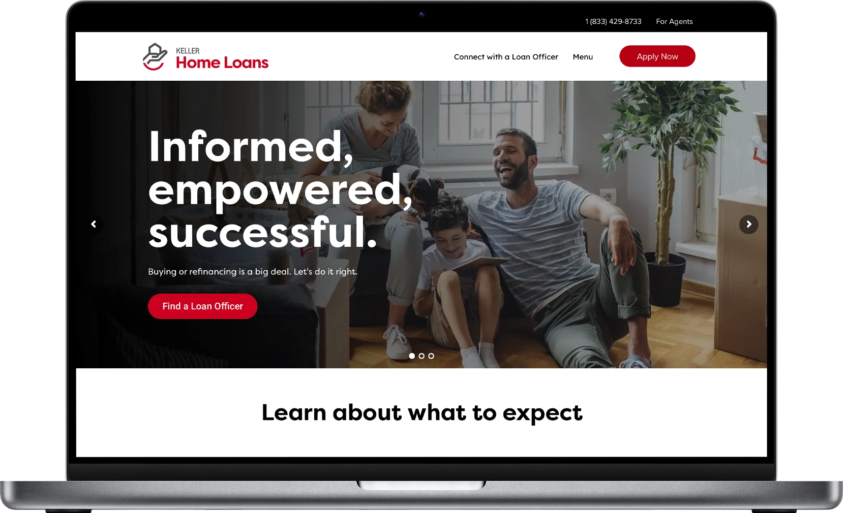
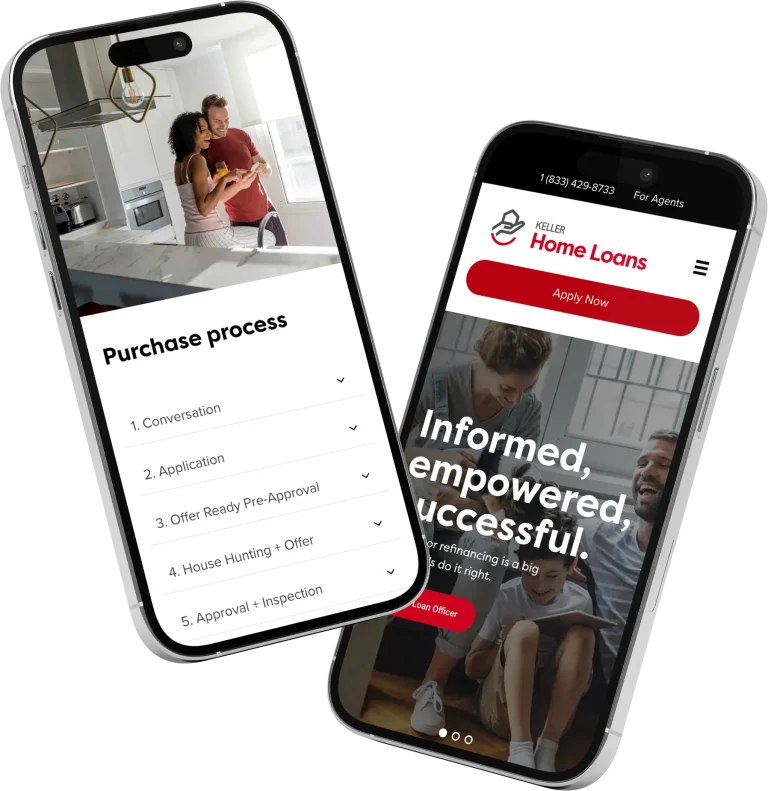
Keller Home Loans, a prominent national mortgage lender, underwent an acquisition which necessitated a complete rebrand. The website, previously characterized by an outdated look with a green and grey palette, was due for a modern overhaul. The redesign aimed to align with the new brand identity while enhancing user experience and functionality.
Research:
- Competitive Analysis: Studied competitors to see modern trends in mortgage lending websites, focusing on usability and branding.
- Analytics Review: Examined user behavior on the old site for areas of improvement.
Brand development:
- Generous Spacing: To enhance readability and focus.
- Rounded Corners: For a softer, more approachable look.
- Bold Colors: To draw attention to key actions like ‘Apply for Loan’.
Design:
- User Journey: Outlined the typical paths users might take on the site, from learning about mortgages to applying for a loan.
- Information Architecture: Simplified the site structure for intuitive navigation.
- Implemented high-quality images of homes and families to evoke the dream of homeownership.
- Used the red color strategically to guide users through important actions or information.
Accessibility:
- Adjusted contrast ratios for better readability.
- Ensured all interactive elements had sufficient hover and focus states for accessibility.
Development:
- Worked closely with a contract developer to ensure the design principles were translated correctly.
Testing:
- Conducted with a focus group including potential homebuyers and existing customers.
- Feedback included positive reactions to the new color scheme but requests for clearer explanations of mortgage products.
Ongoing improvements:
- Regular updates to keep the site fresh, address user feedback, and align with new marketing strategies.
- Continue to gather feedback through direct customer interactions.f
Conclusion:
The redesign of Keller Home Loans’ website not only revitalized its visual identity but also significantly improved user interaction and engagement. The strategic use of color, modern design elements, and a focus on user experience led to better brand alignment, increased user satisfaction, and higher conversion rates. This project exemplifies how a thoughtful redesign can positively impact both branding and business metrics in the competitive mortgage lending industry.

