Case Study
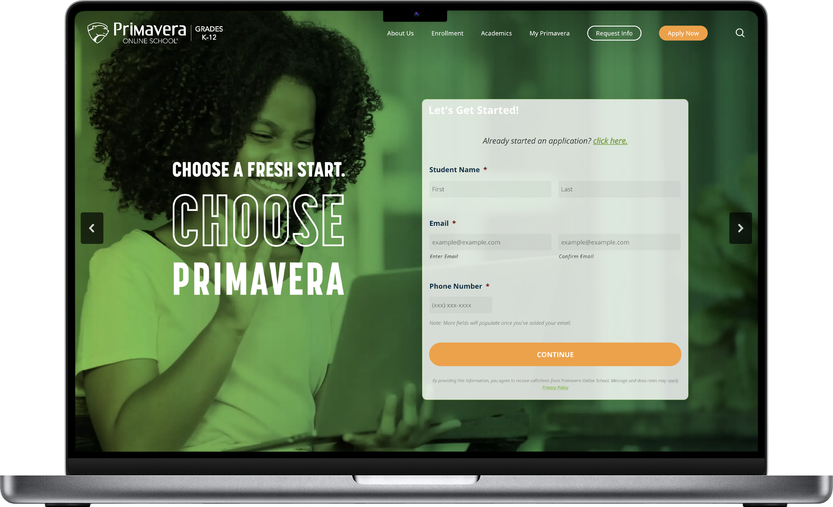
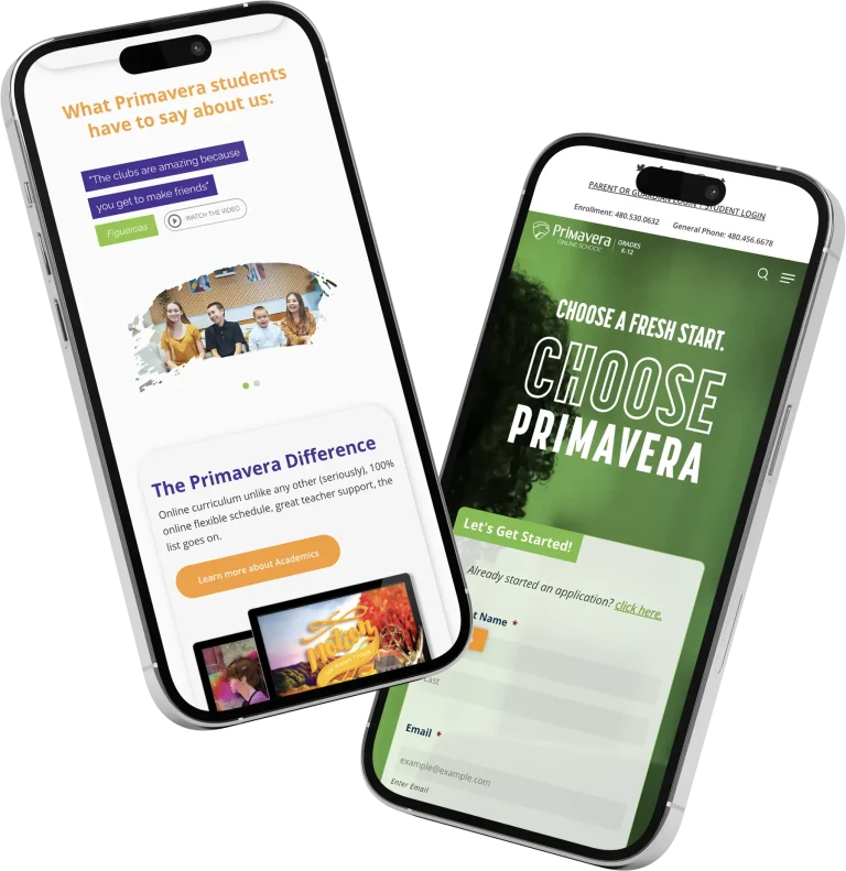
Primavera Online School, a leading virtual educational institution in Arizona, faced challenges with an outdated website that no longer met the needs of its growing user base, which included students, parents, and educators. The objective was to redesign the platform to enhance user experience, boost engagement, and reflect the school’s commitment to modern, accessible education.
Stakeholder feedback:
- The old site was slow, not mobile-friendly, and lacked visual appeal.
- Needed a new site that could handle increased traffic and functionality.
Research:
- What features students and parents valued most.
- Common issues encountered while navigating the current website.
- Best practices in user interface design for educational contexts.
Design:
- Adopted a clean, grid-based layout for consistency and to focus user attention on content.
- Used ample white space to reduce visual clutter.
- Responsiveness across various devices, crucial for an online school setting.
Development:
- Used modern web technologies for fast, dynamic updates like grids and flexbox.
- Emphasized performance with lazy loading for images and optimized asset delivery, as well as using the modern webP format.
- Ensured text readability, contrast, and navigation were optimized for users with disabilities.
Testing:
- Teachers, parents and staff tested the website for navigation ease and functionality.
- Received positive remarks on the aesthetic and functionality, with suggestions for minor usability tweaks implemented in subsequent updates.
Conclusion:
The redesign of Primavera Online School’s website proved to be transformative. It not only aligned with modern educational standards but also significantly enhanced the user experience for parents and faculty. The project demonstrated how thoughtful design and development can lead to increased engagement and satisfaction for parents in the context of an educational website. (Oh, and the CEO was very happy!)
